
The way that the Watts critiques work is simpler. Jeff prints out the images sent in by the students, sits down at his drawing pad and tapes one after the other, tracing over top of them and talks while he does it. We get to see all the students' critiques in the video we're sent, and our personal critique is somewhere in the pile.
Schoolism uses computers. Ha ha. The benefit of their more digital way of doing things is that Jon will be able to show me with a 'Bing' search (inside joke: Jon uses bing on his weekly live stream) what a certain artist does in this or that visual scenario. He can reference artists, show me their work and show me what he's describing and why they do it well etc. I found this super helpful in a ten minute critique he gave me as a preview, in which he mentioned a few things he thought were good and could use improvement on my work. I also think that since art is a visual language, it not only helps to have someone draw over the image, but reference the artwork that has done it well. Jeff will reference artists who do something well, but it's not visible when he's referencing it until you look it up yourself and usually he's moving on to something else unless you pause the video. Now that I'm mentioning that, I might do that more often.
I don't have much good artwork hanging on the walls in my house. It was earlier this year that I remembered why I have this print of Robert Bateman's.

I realized it was because he inspired me as a young artist. I still have the picture up, but he's not as inspiring as he used to be. His work is too hyper real for my interest. I appreciate it, but it doesn't capture the magic of making art as illusion. I think Jeff and Jon agree with me on having more of an appreciation of art that is suggestive and realistic, but not always rendered at every inch. Take this piece below by Jeff. It is not until I squinted my eyes that I could barely make out a fox hat on this man's head. That's COOL. And as I say it's COOL, it's even cooler that I'm still somewhat unsure if it's a fox hat. Ha! It's a bit over the top on this piece, as Jeff comments on his Instagram (Jeff's Instagram) yet it's still amazing and awesome, I think.


Richard Schmid is a master at this kind of loose realism, in which something looks real from a distance, but up close it looks as if a child scribbled in color. That color not only harmonizes as Jeff comments, but it is established while representing something of truth, like a man with a fox hat. (It is easier to see the hat when it's thumb-nailed super small.)
Recently I was at a thrift store and I decided to buy a Claude Monet print that was framed and a cheap price. I liked it for its feeling and atmosphere, but also the fact that I was picking up on all the things I've heard Jon say in his Essentials of Realism course regarding observing and depicting what you see, rather than what you think. I find there to be a great funniness in the sense of illusion that art brings in this way. When I can observe the thumbnail version, or a framed painting at a distance and have it be a person or landscape, but when I go close it looks like pencil and paint markings, I am impressed. I'm not only impressed by the technique, but the other day I was looking at the Monet in that way and I laughed out loud. It's hilarious, for some reason, to be able to make that kind of illusion. I think it reflects the way I perceive life a lot of the time, as a crazy nonsensical movement of energy and my changing perspectives on things. It IS humorous and this kind of art inspires that kind of perspective.
Here is a few close ups of parts of the Monet hanging on my wall and a distance shot where you can see the whole painting that looks real, but it's really an illusion.


Thanks for reading,
Anthony
Recently I was at a thrift store and I decided to buy a Claude Monet print that was framed and a cheap price. I liked it for its feeling and atmosphere, but also the fact that I was picking up on all the things I've heard Jon say in his Essentials of Realism course regarding observing and depicting what you see, rather than what you think. I find there to be a great funniness in the sense of illusion that art brings in this way. When I can observe the thumbnail version, or a framed painting at a distance and have it be a person or landscape, but when I go close it looks like pencil and paint markings, I am impressed. I'm not only impressed by the technique, but the other day I was looking at the Monet in that way and I laughed out loud. It's hilarious, for some reason, to be able to make that kind of illusion. I think it reflects the way I perceive life a lot of the time, as a crazy nonsensical movement of energy and my changing perspectives on things. It IS humorous and this kind of art inspires that kind of perspective.
Here is a few close ups of parts of the Monet hanging on my wall and a distance shot where you can see the whole painting that looks real, but it's really an illusion.

A nice atmospheric landscape.
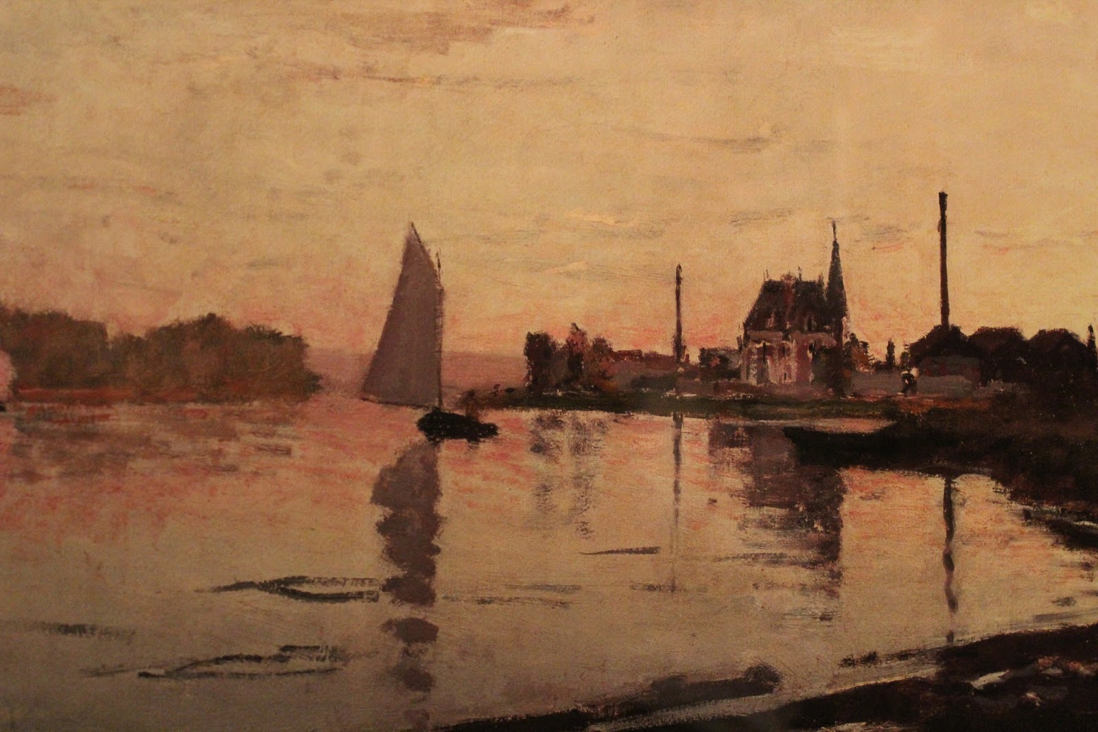
A sail boat and a man standing on it. Wait, is that a paint stroke? Is that man's head just a black smudged dot? That church looks like it has holes in it.

What IS THIS? Those are windows? I can still see the stuff I saw, but it's barely formed at all.

LOOK AT THIS! Amazing. It's just dark shapes, but somehow it comes together as a real thing.

A boat and trees. Really? That's all there is to it? How the...
I think Jon's course will help me identify what's after 'the...' He's a really good teacher for making things clear in the how's and what's of art. One thing I realized he says a lot that Jeff almost never says is to compare something to something else within the painting or drawing you're making. As in, don't say "it's just dark shapes," but ask "is that shape darker or lighter than this other shape?" Again and again, compare to understand. I've never really heard Jeff talk about comparing the values, edges, proportion, shape or anything directly within a single drawing. He'll say the broad concepts over and over, like this is a firm edge or something, but that idea of looking at it within the context of the single drawing is incredibly useful. I think he'll help me, bit by bit, to be able to see how to create an illusion like this boat. Within that close up, it doesn't look like much. Take it back to the big picture, and that boat has the context of the water line, people, church, second boat and so on. That makes a difference.
Thanks for reading,
Anthony
No comments:
Post a Comment